The inverted yield curve: economic recession on the horizon
Something unusual has been happening on the US bond market since October 2022, something that is attracting a lot of interest and is sparking concerns among many economists and investors worldwide. Shorter maturity US government debt instruments generate higher returns than longer maturity government bonds. The yield curve for fixed-interest US government instruments has thus had a negative slope for several months, which is also rising over time. This phenomenon has reliably predicted all the economic recessions in the USA in the past more than 50 years. The current difference between the yield on 3-month US Treasury bills and the yield on 10-year US government bonds is now the highest since 1981. Can similar developments be expected again this time? This article sets out to identify the phases of the business cycle in the USA using the slope of the yield curve and the level of implied stock market volatility. It also attempts to estimate the timing of the next economic recession in the USA, which would have a major impact on the global economy as well.
Published in Global Economic Outlook – April 2023 (pdf, 1.6 MB)
The slope of the yield curve
The yield curve captures the relationship between interest income and bond maturity. The slope of the curve is determined by supply and demand for bonds. The supply-side agent in the case of US government debt instruments is the Department of the Treasury, which regularly announces auctions for such instruments. The instruments are broken down by maturity into 3- to 6-month Treasury bills and 2-, 5-, 10- and 30-year government bonds. On the demand side are a whole range of agents. Debt instruments with shorter maturities are purchased mainly by commercial banks and conservative retail investors. Instruments with longer maturities, i.e. bonds with a maturity of ten years or more, are bought mostly by foreign central banks, governments and insurance companies. The yield curve is normally upward sloping, with longer maturity debt instruments generating higher interest income than ones with an earlier maturity date. This phenomenon can be explained by the liquidity preference theory, according to which investors demand higher interest income (premium) on securities with longer maturities to reflect their higher risk. However, the opposite situation arises in some periods – often amid higher inflation and higher interest rates – when shorter maturity bond yields are higher than longer maturity ones. In such cases, when the yield curve is falling, we speak of an inverted yield curve.
An inverted yield curve and the investor behaviour that leads to such an unusual situation can be explained using the expectations hypothesis of the term structure of interest rates. This hypothesis says that the current yield curve slope is determined by expected future interest rates. If the market expects a future economic downturn, long-term interest rates fall and short-term interest rates can go above long-term ones. Investors’ decision-making in an environment of uncertainty and elevated risk generally leads to capital being transferred from more risky assets (shares) to less risky ones (government bonds). As demand for bonds rises, bond prices increase and bond yields conversely fall. To some extent, the yield curve slope thus reflects market sentiment, which is forward-looking.
The slope of the yield curve is often mentioned in the literature in the context of the forecasting of phases of the business cycle. Studies on the relationship between the yield curve and recessions started to emerge in the 1980s in response to the inability of complex macroeconomic models to predict sudden falls in economic activity. The ability to predict phases of the business cycle using the yield curve slope was first mentioned in Laurent (1988) and Estrella and Hardouvelis (1991). Moreover, Harvey (1988) and Estrella and Hardouvelis (1991) state that differences in yields across yield curve maturities can also be used to forecast other economic variables (such as consumption and investment growth). Estrella and Mishkin (1998) mention that the yield differential has a strong predictive ability for predicting recessions one year ahead in the long run.
Internationally, however, the ability of the yield curve slope to predict future recessions has not been clearly confirmed (unlike in the case of the USA). Chinn and Kucko (2015) conclude that the yield differential has relatively good predictive power for forecasting recessions in the cases of Canada and Germany, but worse power for Japan and Italy. Michl (2018) also mentions the negative slope of the US yield curve as a warning sign of an approaching recession. Michl notes that the last seven recessions in the USA were preceded by an inverted yield curve. Brainard (2018) shows that a flat or inverted yield curve on the bond market can signal that short-term interest rates are too high relative to the current position of the economy in the cycle and may thus represent a risk of it being dragged into a recession. For example, However, Yellen (2019) takes the view that the negative slope of the US yield curve may be signalling only an economic slowdown, not necessarily an imminent recession. According to Yellen, the inverted yield curve may signal the need for the US central bank (the Fed) to cut its key interest rates. Moreover, Yellen believes that there has been a tendency for the yield curve to be very flat in recent years. A study by Rizzi and Mueller-Glissmann (2019) reaches a similar conclusion. They examined the proportion of the yield curve in the USA inverted since 1975 across all maturities. The arguments for why the current negative slope of the yield curve may not signal an imminent recession include, for example, those made by economists Korapaty and Marshal (2023) who mention in their study that a large proportion of the inversion reflects the past period of very low real interest rates, while the US economy is also now in better shape than in previous cycles. In their view, the current inversion of the yield curve will not last long, as high interest rates will gradually feed through to investor expectations, leading to an upward revision of long-term interest rates.
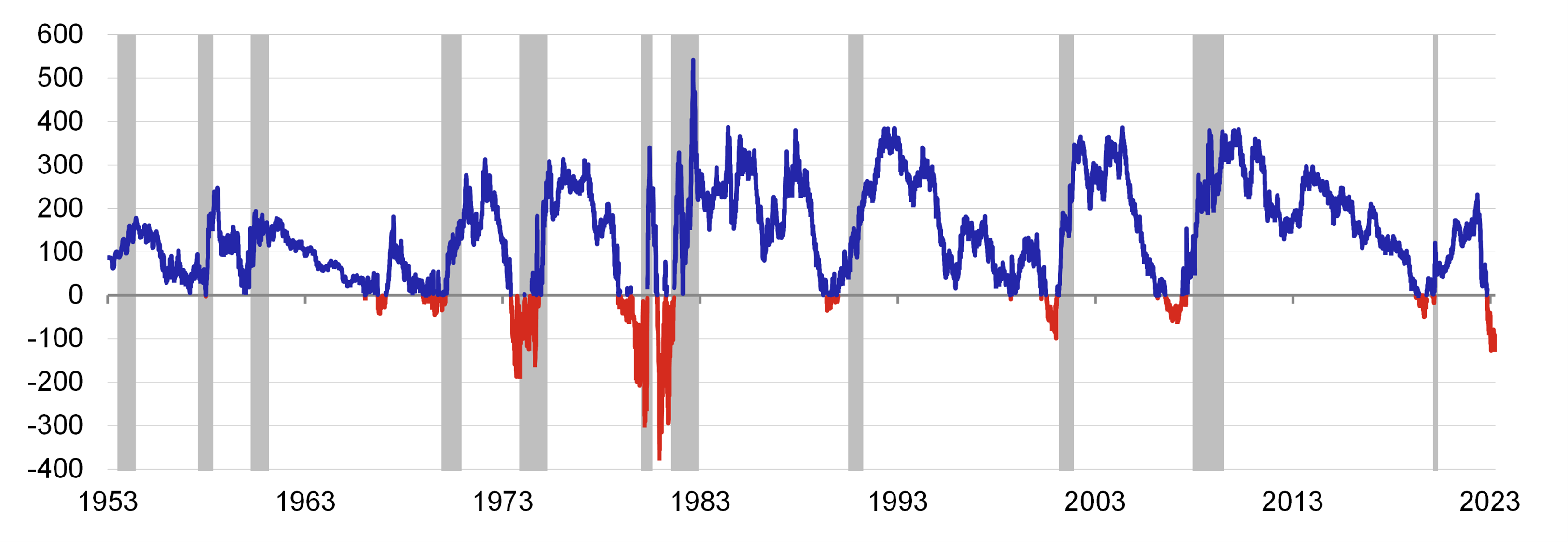
The difference between the yields on the 10-year US government bond and the 3-month Treasury bill is commonly used in the literature to illustrate the yield differential between long and short maturity instruments. Chart 1 captures this relationship from 1953 to the end of March 2023. It shows that past recessions (grey areas) have often been preceded by negative values of this difference, i.e. the 3-month T-bill yield was higher than the 10-year bond yield. This situation has occurred in the US economy only 10% of the time over the past 70 years and is thus a relatively isolated phenomenon. This situation arose again on 27 October 2022. Apart from three days at the start of November, this interest rate differential has been negative ever since, and its value continues to increase over time. The current level of the differential is around -126 basis points, while a lower value was last recorded on 19 June 1981 at -140 basis points.
Chart 1 – Difference between the yields on the 10-year US government bond and the 3-month Treasury bill
(basis points)
Source: Federal Reserve Bank of St. Louis (FRED Database), National Bureau of Economic Research (NBER), Bloomberg, authors‘ calculation
Note: Daily data, the grey area defines the recession period of the US economy according to data from the National Bureau of Economic Research (NBER). The blue line denotes the period when the yield curve was rising, while the red line denotes the period when the difference between the 10-year and 3-month yields was negative, i.e. the yield curve was falling.
Implied stock market volatility
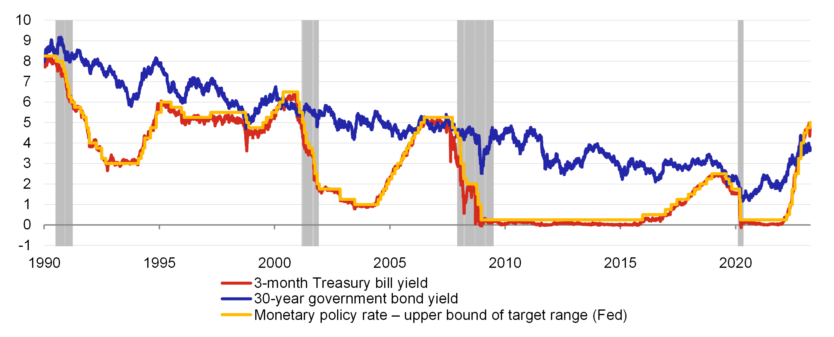
A significant inverse statistical relationship between future stock market volatility and the yield curve slope, which is strongly affected by Fed monetary policy, can be observed in the historical data. The Fed directly affects the short end of the yield curve by setting short-term nominal interest rates as its main instrument (see Chart 2). It also indirectly affects the yield curve at its longer end through market agents’ inflation expectations, formed on their perceptions of the central bank’s actions.[1] A period of a steeply rising yield curve thus reflects accommodative Fed monetary policy (a falling short-term interest rate). In such periods, stock markets are optimistic, share prices are set for long-term growth and volatility is low. By contrast, periods of a very flat or inverted yield curve reflect tight monetary policy (a rising short-term interest rate), which negatively affects firms’ profits, leading to a fall in share prices and growing stock market volatility.
Chart 2 – The Fed’s monetary policy interest rate and 3-month and 30-year US government bond yields
(%)
Source: National Bureau of Economic Research (NBER), Bloomberg
Note: Daily data, the grey area defines the recession periods of the US economy according to data from the National Bureau of Economic Research (NBER).
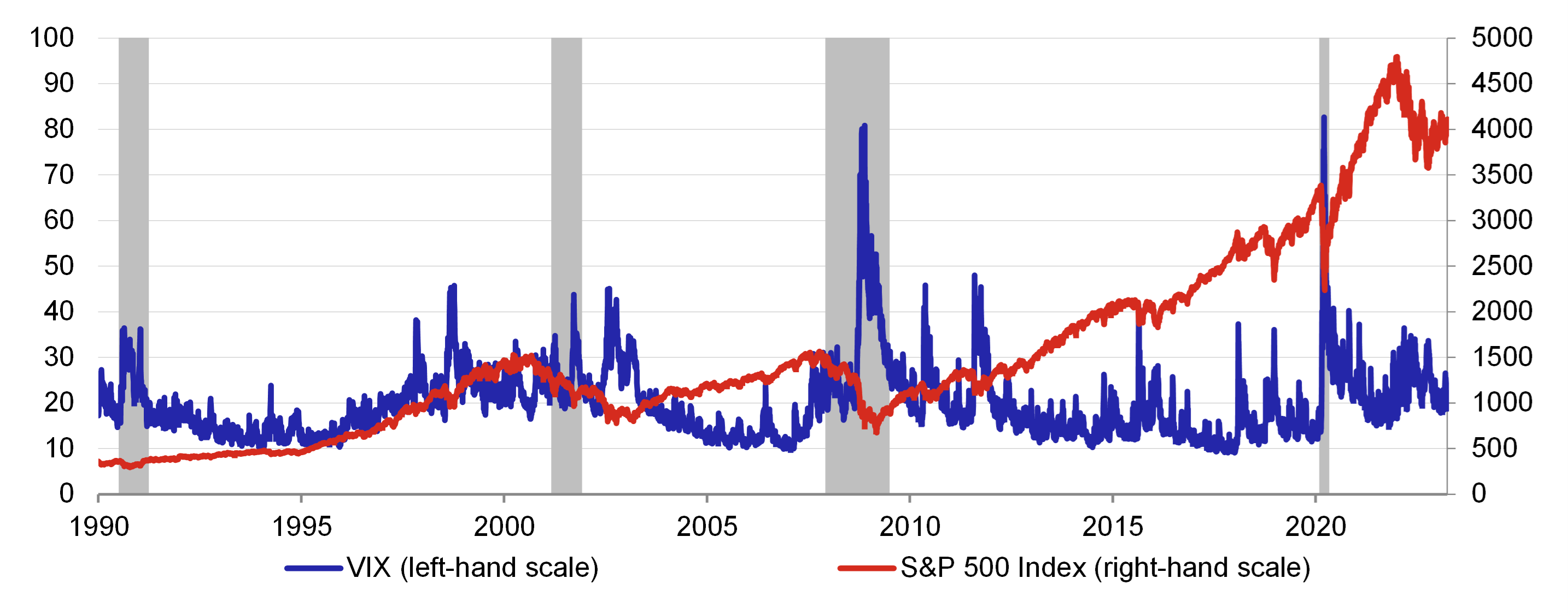
Stock market volatility can be measured using the volatility index (VIX)[2], which is calculated in real time and represents the expected price volatility of the S&P 500 stock index over the next 30 days. In terms of technical construction, the VIX is unique in that it approximates the level of future stock market volatility based on the implied volatility derived from option prices. It thus does not measure the same type of volatility as most other indicators, which derive it solely from historical data. The VIX rises in times of expected greater uncertainty (and hence greater stock price volatility), while staying low in calm times. It thus represents an objective measure of perceived market risk and investor sentiment across all sectors of the economy and is therefore referred to as the “Fear Index”.
There is an inverse relationship between the S&P 500 and the VIX most of the time. The VIX tends to rise when the stock market is falling. Conversely, implied volatility levels are stable or falling when stock prices are rising (see Chart 3). This is due to the construction of the VIX, which is derived from the implied volatility of option prices. The VIX goes up when demand for options on the market is strong, which usually happens during stock market corrections. To protect against risk, investors, who mostly hold long positions, buy put options to hedge their portfolios. By contrast, demand for put options goes down and the VIX falls when the stock market is rising.
Chart 3 – The VIX and the S&P 500 stock index
(%)
Source: National Bureau of Economic Research (NBER), Bloomberg
Note: Daily data, the grey area defines the recession periods of the US economy according to data from the National Bureau of Economic Research (NBER).
Relationship between the yield curve slope and implied stock market volatility
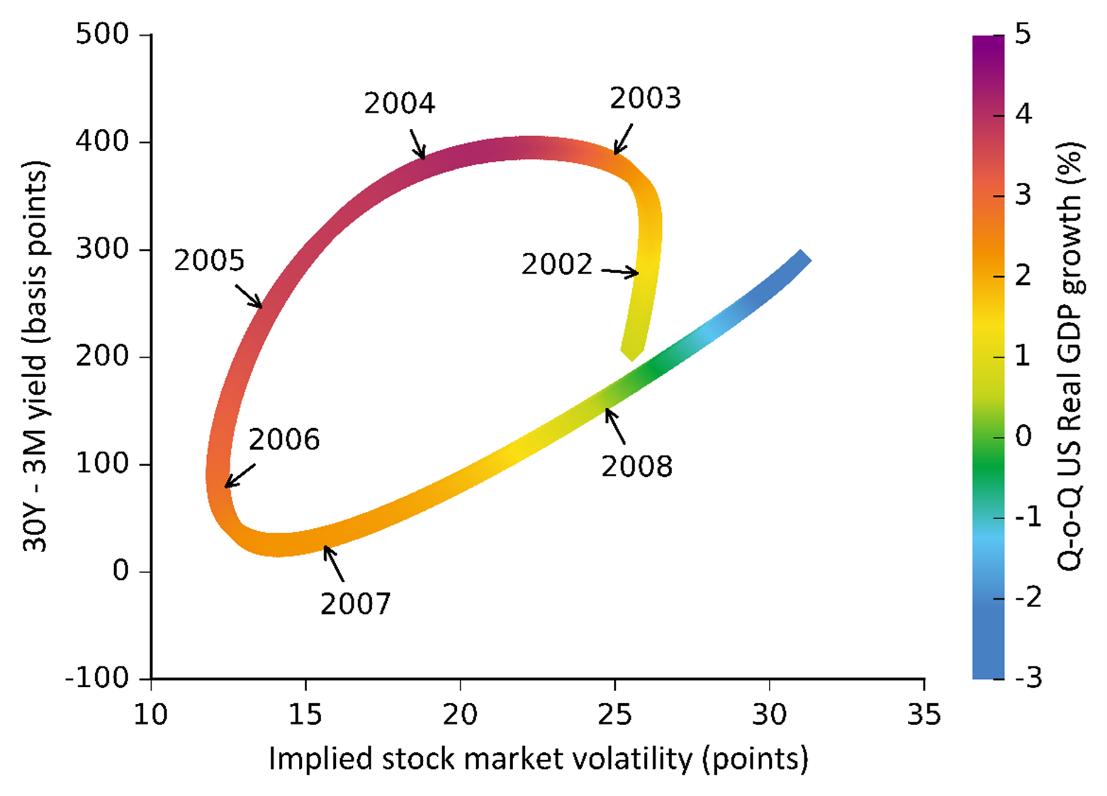
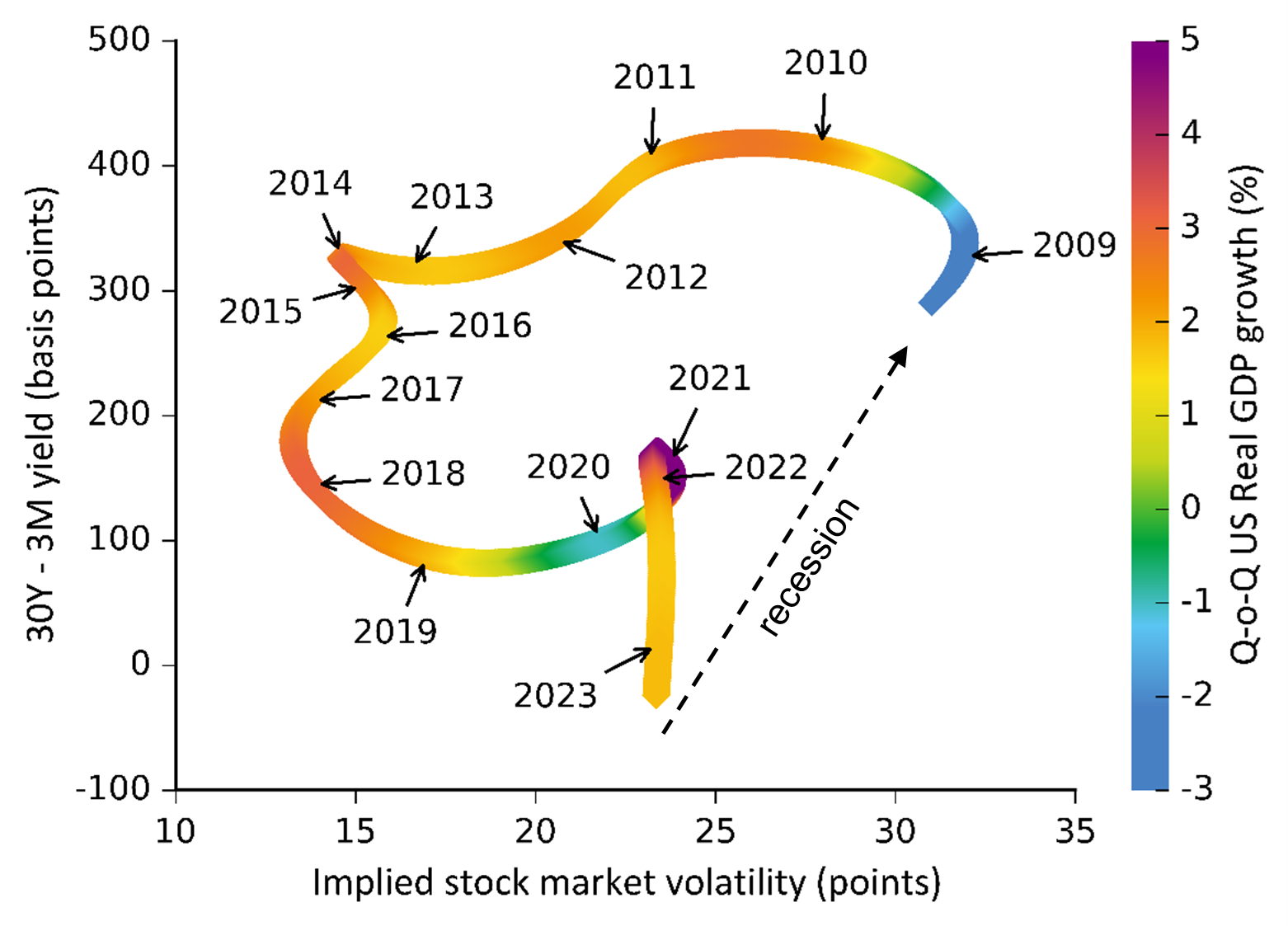
The relationship between the yield curve slope and the volatility level on the US stock market (VIX) can be illustrated using a dot chart taking the rate of US economic growth into account. The x-axis shows the value of the VIX, which represents the level of investor perceived risk on the US stock market. A movement to the right along the x-axis means growth in volatility. The y-axis shows the difference between the yields on the 30-year US government bond and the 3-month Treasury bill. This difference between the two most distant maturities thus captures the behaviour of the yield curve as a whole. Growth in this difference (an upward movement along the y-axis) means that the long-term yields are rising relative to the short-term ones, and thus the yield curve is also rising more steeply. Conversely, a decrease in this difference represents growth in the short-term yield relative to the long-term one, which leads to a flattening of the yield curve (a downward movement along the y-axis). The third dimension of this chart is a colour map depicting quarter-on-quarter US real GDP growth for each observation on the x- and y-axes of the dot chart. As economic growth starts to rise from the low levels recorded during a recession, the dots in the chart gradually change colour from blue-green to orange-purple, which represents peak quarterly growth in economic activity.
The following dot charts show the course of the three most recent business cycles in the USA, including the current cycle. Daily data from October 1990 to the end of March 2023 were used to show the volatility levels and the yield curve slope. Due to the very high volatility of the daily data, particularly in the case of the VIX, which reflects day-to-day changes in investor sentiment, all the input time series were smoothed using the Hodrick-Prescott filter, as were the quarter-on-quarter US GDP growth data, which are available at quarterly frequency. The diagrams generated in this way, describing the relationship between the yield curve slope and the level of implied volatility on the stock market, at first glance form distinct, regularly repeating cycles going anticlockwise (see Charts 4–6). This regularly repeating model of behaviour, reflecting the course of the business cycle, can be divided into four phases:
- Recession – separates the end of the previous and start of the new business cycle, economic activity cools significantly, inflation pressures weaken and short-term interest rates decrease, the slope of the yield curve rises steeply amid high – and further increasing – stock market volatility. This causes the curve in the diagram to shift upwards to the right.
- Early growth phase – economic growth starts to pick up amid a gradual rise in inflation and stable short-term interest rates, the slope of the yield curve rises and stock market volatility starts to fall sharply (the curve in the diagram shifts upwards to the left).
- Advanced growth phase– inflation accelerates and short-term interest rates rise amid solid economic growth, the slope of the yield curve starts to flatten rapidly and stock market volatility is low, which reflects the downward shift of the curve of the diagram.
- Late growth phase – the rate of economic growth is already close to its peak, both inflation and interest rates are high, the slope of the yield curve is zero or even negative and stock market volatility rises on concerns of a slowdown in economic growth and an approaching recession; at the same time, investments are being moved into less risky assets, causing the stock market to correct from its highs (a downward right shift of the curve in the diagram).
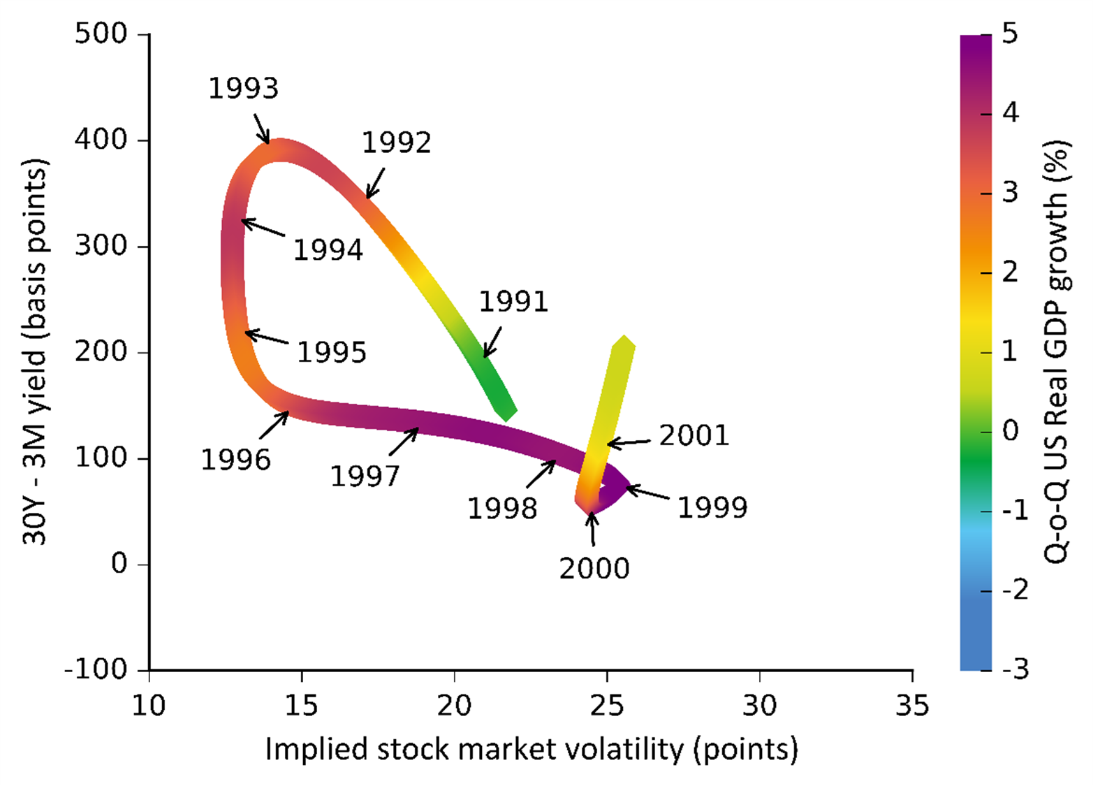
The first cycle describes the period from October 1990 to July 2001, which ended with the bursting of the dotcom tech bubble (see Chart 4). The 1990s went down in the history of the US economy as a time of strong economic growth, steady job creation, low inflation, rising productivity and a surging stock market. This was also fostered by a substantial easing of Fed monetary policy. It cut its key interest rate significantly from 8.25% to 3% at the start of the 1990s, resulting in a steep rise in the yield curve until the end of 1992. The Fed later started to tighten its monetary policy, which led to a rapid flattening of the slope of the yield curve in 1993–1996. The US economy also proved resilient to negative external shocks in the second half of the 1990s, when several financial crises occurred around the world.[3] The increasing risk in the global economy was reflected on the US stock market in the form of several minor corrections and a sharp rise in volatility amid only a slight flattening of the yield curve. At the end of the 1990s, the US stock market experienced a surge in technology stock prices, even though tech firms’ revenues were rising at a much slower rate. Fed monetary policy tightened rapidly between June 1999 and May 2000, when the short-term interest rate rose from 4.75% to 6.50%. The “bursting” of the bubble and a significant stock market correction subsequently triggered a recession and unemployment growth. A subsequent sharp reduction in interest rates amid high stock market volatility resulted in a rapid rise in the slope of the yield curve – see the upward vertical shift on the y-axis in the chart.
Chart 4 – First cycle: October 1990 – July 2001
Source: Bloomberg, author’s calculations
Note: Time series were smoothed using the Hodrick-Prescott filter.
The second cycle, describing the period from August 2001 to September 2008, ended for a change with a property bubble burst (see Chart 5). This time, the recession was caused mainly by extreme price growth on the property market during the advanced growth phase in 2003–2005. It was also partly due to insufficient banking regulation and supervision and to the extremely accommodative monetary policy of the Fed,[4] which cut its key interest rate from 6.5% to just 1% in 2001–2003. In mid-2004, the Fed started to tighten its monetary policy significantly, to 5.25% in mid-2006. This caused the yield curve to flatten rapidly – its slope turned negative that year for the first time since the previous recession in 2001. Property prices thus stopped rising and in 2007 started to fall. This also led to very fast growth in stock market volatility. In October 2007, the Fed started to rapidly reduce interest rates again, which was also reflected in the rapid rise in the slope of the yield curve – see the upward shift to the right in the chart. The subsequent panic peaked in September 2008 with the fall of the fourth largest US investment bank – Lehman Brothers. The bank thus became the first victim of the mortgage crisis, which ended in an extremely deep global economic recession.
Chart 5 – Second cycle: August 2001 – September 2008
Source: Bloomberg, author’s calculations
Note: Time series were smoothed using the Hodrick-Prescott filter.
The third and last cycle, which is still ongoing,[5] describes the period from October 2008 to the end of March 2023 (see Chart 6). The current cycle, which started with economic recovery in mid-2009, can be described as the longest business cycle in more than 200 years. A slow rate of economic growth in the recovery phase, in a situation where interest rates had reached the zero lower bound in December 2008, led the US central bank to deploy unconventional monetary policy in the form an asset purchase programme known as quantitative easing (QE). The three rounds of QE, lasting until the end of 2014 – which led to an increase in the Fed’s balance-sheet total from USD 900 billion to almost USD 4,500 billion – ultimately led mainly to a rise in bond prices and a drop in borrowing costs, and also to stock price growth and a fall in stock market volatility, rather than to accelerating growth and inflation. The Fed’s purchases of longer maturity bonds resulted in some distortion of the yield curve. The administratively created demand artificially depressed yields at the long end of the yield curve. With the Fed’s short-term nominal rates stable at the zero lower bound, this led to a flattening of the yield curve.[6] These measures thus extended the period of accommodative monetary policy, also contributing in large measure to the extension of the business cycle. The Fed made the first increase in its key interest rate in the post-crisis period in December 2015 and continued to tighten monetary policy gradually until December 2018 when the key interest rate reached 2.50%. The tightening of monetary policy by the Fed in that period amid a cooling of the pace of economic growth was accompanied by a flattening of the yield curve. In March 2019, the slope of the yield curve finally turned negative again for the first time since August 2007 for only 5 days. The yield curve was subsequently inverted from May to the start of October 2019. As depicted in the diagram, at that time the cycle was already in the late growth phase where, in addition to the inversion of the yield curve, implied stock market volatility was also growing and the economy was already heading into a recession phase. Meanwhile, the Fed started a cycle of gradual monetary policy easing again in summer 2019 in an effort to support the economy, when it cut interest rates to 1.75% in October 2019. It kept them at this level until early March 2020, when the world had already been hit hard by the Covid-19 pandemic. Central banks worldwide responded by sharply easing monetary policy to mitigate an economic disaster. In the case of the Fed, this meant an unprecedented sharp reduction in interest rates in the first half of March by 50 and 100 basis points to the zero lower bound to a range of 0% to 0.25%. At the same time, the Fed resumed quantitative easing on a massive scale and introduced a wide range of other support measures, which resulted in its balance sheet growing by 70% to more than USD 7000 billion in the first half of 2020 alone. Interest rates were left at zero until March 2022. Long before that – after the initial panic and a certain lack of experience with a natural disaster of this nature (pandemic) had subsided – it was clear that the extent of monetary policy easing, which corresponded more to a demand crisis, was inadequate. The significant, albeit short-term, recession in 2020 was due mainly to a decrease in potential (supply) and, just like any other natural disaster, had adverse stagflationary supply-side effects overall.[7] However, most central banks around the world misinterpreted monetary policy error which, among other things, resulted in a rise in significant inflation pressures to which the Fed responded with a lag, but all the more aggressively by sharply increasing interest rates by 500 basis points in just 12 months to March 2023.[8] This also resulted in a significant inversion of the yield curve amid a broadly stable albeit increased level of implied stock market volatility, see the downward vertical shift of the curve of the diagram.
Chart 6 – Third cycle: October 2008 – still ongoing
Source: Bloomberg, author’s calculations
Note: Time series were smoothed using the Hodrick-Prescott filter.
From the perspective of the circular diagram, which takes into account the bond and stock market situation, the current position of the US economy corresponds to the late growth phase of the cycle. In the past, this phase was observed in 1997–1999, 2006–2007, but also recently in 2018–2019 when a recession caused by a natural disaster of a supply nature prevented the natural completion of the business cycle. Therefore, it was not a standard crisis of a demand nature, where the drop in economic activity are due to factors inside the economic system in the form of a sudden market response to accumulated market imbalances. This thus led to the postponement of the end of the business cycle in the usual way. According to the circular diagram, the yield curve has now reached even greater extremes of inversion than before 2020. Moreover, in a situation of rapidly rising interest rates, a higher accumulation of global imbalances, including greater debt at all levels, may subsequently cause an even deeper economic recession. The significant tightening of monetary policies is already starting to negatively affect the financial sector and has partly contributed to the collapse of several regional banks in the USA and to the problems and subsequent forced takeover of Credit Suisse in Europe.
The next phase of the current cycle is the recession phase, the likelihood of which seems very high – based on historical experience it is already less than 24 months away. This potential future continuation of the current cycle is shown as a black dotted line in Chart 6. This assumes a further possible moderate increase in Fed interest rates above the current 5% level, with interest rate stability expected to follow. However, also given the stable short end of the yield curve, its negative slope is likely to rise further. The could be due to a decline in inflation expectations, reflecting the expected economic slowdown, which will lead to a drop in yields at the longer end of the yield curve through increased demand for less risky assets (longer maturity bonds). Stock market volatility could rise further due to a shift in the behaviour of investors, who will increasingly hedge against a stock market correction (by buying put options increasing implied volatility) in expectation of a worse economic outlook. The big unknown is always which factor could trigger a possible crisis this time. However, the inverted yield curve is a relatively clear signal from the market that a recession may not be far off. Its emergence, though, depends on how fast the combination of high interest rates and an inverted yield curve, along with stock market correction, will tighten the credit channel in some sectors of the economy. Persistent inflation anchored at high levels for a long time, whose compression to the inflation target would require additional significant tightening of monetary conditions, is currently a major risk – as we have also learned from a similar experience of the US economy in the early 1980s. In response to the resulting economic downturn and inflation pressures, the Fed would later start to rapidly ease monetary policy for a certain period of time. A potential drop in interest rates would thus, ceteris paribus, push the short end of the yield curve down faster relative to the longer end and the slope of the yield curve would start to rise steeply again. In this situation, the level of implied volatility would also increase on the US stock market, depending on the extent to which stock market investors would fear a future recession and on the expected depth of the stock market correction. This would cause the curve of the diagram to shift upwards to the right, thus definitively closing the circle of the current longest cycle in modern history.
Conclusion
The use of the yield curve to predict future economic recessions could be a relatively simple and suitable addition to standard and complex macroeconomic modelling. Information from the government bond and stock markets, which are essentially forward-looking, can be used quite reliably to predict sudden events such as recessions, which are generally very hard to predict.
An inverted yield curve may signal the risk of a recession occurring in the next 12 to 24 months, as has been the case with all economic recessions over the last more than 50 years. However, there have also been periods in the distant past when the yield curve has flattened significantly or become inverted without signalling an imminent recession. These periods were generally characterised by low yields and a flat yield curve. Such a pattern in the current cycle is supported, on the one hand, by until recently long-standing low short-term interest rates, which have been below their long-term equilibrium levels for several years now, and, on the other hand, by the impacts of quantitative easing, which have lowered the longer end of the yield curve. In such an environment, the yield curve could easily invert without necessarily signalling an approaching recession, as was the case in mid-1960s.
Despite some differences, however, similar trends to those in previous cycles have been identified in the current one. As shown by data on the difference between the yields on 30-year bonds and 3-month T-bills in conjunction with the implied volatility of S&P 500 options, the US economy can be quite clearly identified as being in a late growth phase of the business cycle using this relationship. This phase is characterised by a tightening of Fed monetary policy, reflected in a relatively steep rise in short-term yields relative to long-term ones. This is resulting in the current relatively extreme inversion of the yield curve, whose negative slope is reaching its highest level in more than 40 years. The pace of economic growth has gradually slowed from its peak, while a deeper stock market correction has been underway for more than a year now amid a permanently increased level of implied volatility compared to the historical average.
Taking the identified current phase of the cycle into account, our analysis of previous economic cycles in the USA suggests that the risk of an economic recession occurring in less than 24 months is very high
Author: Martin Motl. The views expressed in this article are those of the author and do not necessarily reflect the official position of the Czech National Bank.
References
Benecká, S., Kábrt, M., Komárek, L. and Polák, P. (2023): Do the breadth and intensity of the tightening of monetary conditions affect their impact on the global economy? Global Economic Outlook. Czech National Bank. January 2023.
Bonis, B., Ihrig, J. E. and Wei, M. (2017): The effect of the Federal Reserve’s securities holdings on longer-term interest rates. GMU Working Paper in Economics, 20. April 2017.
Brainard, L. (2018): Sustaining full employment and inflation around target. Speech on 31 May at the Forecasters Club of New York.
Brůha, J., Motl, M. and Tonner, J. (2021): Assessment of the impacts of the pandemic on the world’s major economies: A crisis of supply or demand? Global Economic Outlook. Czech National Bank. May 2021.
Chinn, M., and Kucko, K. (2015): The predictive power of the yield curve across countries and time. International Finance, 18(2), pp. 129–56.
Estrella, A., and Mishkin, F. (1998): Predicting U. S. recessions: financial variables as leading indicators. The Review of Economics and Statistics, MIT Press, 80(1), February, pp. 45–61.
Estrella, A., and Hardouvelis, G. (1991): The term structure as a predictor of real economic activity. Journal of Finance, 1991, 46, 2, pp. 555–76.
Harvey, C. (1988): The real term structure and consumption growth. Journal of Financial Economics, 22, 2, pp. 305–33.
Korapaty, P. and Marshall, W. (2023): Why this yield curve may not signal a U.S. recession. Goldman Sachs Research. 8 February 2023.
Laurent, R. D. (1988): An interest rate-based indicator of monetary policy. Economic Perspectives, Federal Reserve Bank of Chicago, January, pp. 3–14.
Michl, A. (2018): Americká výnosová křivka varuje. Hospodářské noviny. 17. červenec 2018.
Mueller-Glissmann, C. and Rizzi, A. (2019): Goldman joins chorus warning against yield curve panic. Bloomberg. 26 March 2019.
Smets, F. and Tsatsaronis, K. (1997): Why does the yield curve predict economic activity? Dissecting the evidence for Germany and the United States. Bank for International Settlements. Working Paper No. 49. September 1997.
Taylor, J. B. (2009): The financial crisis and the policy responses: An empirical analysis of what went wrong. Working Paper 14631. National Bureau Of Economic Research. NBER Working Paper Series. Cambridge.
Yellen, J. (2019): Yield curve may signal need to cut rates, not a recession. Reuters. 25 March 2019.
Keywords
yield curve, monetary policy, bond market, stock market, business cycle
JEL Classification
B22, B26, D53, E52
[1] Central bank credibility is another important factor affecting the longer end of the yield curve – see Smets and Tsatsaronis (1997).
[2] The VIX was unveiled in 1993 and initially only measured the implied volatility of at-the-money S&P 100 options. In 2003, however, the Chicago Board Options Exchange (CBOE) started to publish this index based on the broader S&P 500, which reflects the dynamics of the broader US stock market. It simultaneously changed the calculation method, which now includes out-of-the-money options, i.e. options at strike prices with a delta of less than 50, in addition to the implied volatility of at-the-money call and put options. As regards the time to expiration of the index component, the VIX only contains call and put options with more than 23 days and less than 37 days to expiration. Moreover, the time series since 1990 was consistently recalculated when the new calculation method was introduced.
[3] Mexico (1995), Asia (1997), Russia (1998) and Argentina (1999).
[4] See Taylor (2009).
[5] According to the indicators of economic activity used, the National Bureau of Economic Research (NBER) officially identified a recession in the USA in the first half of 2020. However, compared to a standard demand crisis, like the one in 2009, the nature of the Covid-19 pandemic shock was as such that many economic agents would like to continue to consume or produce, but were prevented from doing so by the pandemic situation and anti-epidemic measures. This is apparent from the subsequent very rapid recovery in economic activity and sentiment reflecting a very strong demand after shutdowns were lifted, which was also confirmed by the estimate of households’ saving rates, which soared to a record high in 2020 Q2. In this context and based on the movement of the circular diagram, which signals a continuation of the cycle, this analysis perceives the Covid-19 pandemic as only a short-term fluctuation of a non-fundamental nature within the current cycle.
[6] Bonis, Ihrig and Wei (2017), for example, estimate that the three consecutive QE programmes in 2008–2014 resulted in a flattening of the longer end of the yield curve of up to 100 basis points.
[7] See Brůha, Motl and Tonner (2021) who, based on an empirical comparison of the Covid-19 pandemic-induced crisis with the global financial and economic crisis and model simulations, demonstrated that the sharp economic downturn observed in 2020 bore, for the most part, the hallmarks of a supply shock. In this context, they pointed out that any misinterpretation of the impacts of the Covid-19 pandemic as having exclusively negative demand effects would lead to a more significant overshooting of central banks’ inflation targets if they continued to maintain excessively accommodative monetary policy.
[8] In addition, the surge in inflation from the second half of 2021 has led to a sharp and synchronised tightening of monetary conditions across the global economy, see Benecká, Kábrt, Komárek and Polák (2023).